
I decided I better make a few more visits to the neighbor's flower garden with my camera before cold weather sneaks up on me. Actually we should have a few more weeks, but you how it is when you put things off. Before you know it there is a sudden frost and those flowers begin to go.
So here are a few of the beautiful flowers and plants we have been enjoying this summer.
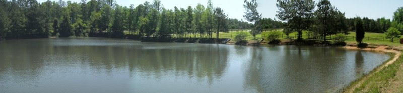
There are always a few of these below growing wild along the edge of the pond and hanging out over the water.
I've always loved these large leaves below with the curved veins in so many colors. I didn't realize until I downloaded the photo that I had also captured a small lizard. I imagine a surface like that would complicate being able to change colors to hide but I guess he was doing OK since I did not see him.
I think this last one may be my favorite of the day. You may recognize it as one of the flowers I used in the 'Something A Little Different' post last week.
We made another visit yesterday and I was able to capture a few photo's of butterflies among the flowers. Look for an upcoming post on that visit.
3 weeks ago


.jpg)
These are lovely. The green and yellow frames around each one add to the effect. I especially enjoy the pink cosmos set against the sky.
ReplyDeleteThe Zinnias are always such striking colours...I always grow them from seed each spring for my Dad....
ReplyDeleteI love the canna leaves, they do not do well here due to the heavy clay soil and the harsh frosts.....they would have to be taken in when autumn ends.....
I love the photographs and I have to agree the cosmos shot is beautiful......
I just love that purple flower on top! What is the name of that flower?
ReplyDeleteYour photo of the canna leaves and the lizard is just perfect!! They are all beautiful, but that one is my favorite!
ReplyDeleteThese are really lovely. I particularly love the first shot- it is so pretty! The lizard that you captured on the leaf is a wonderful detail.
ReplyDeleteHi I'm Joni. Your pictures are absolutely beautiful. I have no talent when it comes to taking pictures so I will be coming back to enjoy yours. Thank you.
ReplyDeleteleora - Thanks - I like the frames also. I didn't realize they would perk of the photographs so much but now when I look back at earlier posts with no frame they look naked, lol.
ReplyDeleteCheryl - I really like those canna leaves, too. they are a bit tropical looking with their size and colors. I've taken a few photo's of their flowers but lots of the leaves, lol.
Wayne - The first flower is a Zinnia. The last flower is a Cosmos. Thanks for dropping by and the 'follower' link.
spookydragonfly - I liked that lizard, too. I'm frequently surprised when I find something in a photo that I missed completely in person. It's always a little treasure hunt when I download the pics.
foreverfoster - Thanks so much. The day was quite breezy so I didn't get very many good pics. The flowers were swaying back and forth continuously. BUT, I've made some return trips and will have some more up soon.
Baker
joni - Didn't mean to leave you out, lol. I was writing the above comment when you commented. Thanks for dropping by and the kind comments. And thanks for the 'follow'.
ReplyDeleteBeauty!
ReplyDeleteBaker..I love the little lizard in the photo. We too will be having a frost sometime soon. Sigh...The summer was too short this year.LOL..
ReplyDeleteIt's funny, because I was going to ask what plant the lizard was on. I never knew canna's had such lovely variation on their leaves. Probably because the only ones I see here in Philly are from a Big Box store.
ReplyDeleteIn light of frames, I'd like to add a little tale, if you don't mind. Back when, I went to a Van Gogh show in NYC. One of his paintings, he'd painted a red "frame" around. I was maybe twenty and in art school.
I overheard, as one will at these things, people talking about his framing device. They said that it would make any painting work, that it was a "compression colour". (I've found that it does the complete opposite to my big ole body)!
Needless to say, I painted a red frame around several of my next paintings. As you may imagine, for some it worked. Others? Mm, not so much.
When I bought the "habitable shell" that I live in now, ten years ago, one thing besides it's size and beauty struck me. The hallway and stairway walls, over the years, had been painted over by a soft rose pink enamel. Those last three words had never played a part in my ideas about interior decor.
But we found an odd thing out. Every piece of art that we've hung on the pink walls is enhanced by that colour! I've had paintings by others that I love blossom anew with this background. it's to the point that if I'm ever enough in a gallery that I show in, I'd paint the walls "Maria Pink". Maria was the old lady that we bought the house from.
Me, a dyed-in-the-wool lover of black.
But your photos remain astounding, regardless of your frames.
Baker, your photography is outstanding, my friend!!!
ReplyDeleterdl - Hey there and thanks for dropping by - It's good to have a PhotoHunter check out some of the other posts
ReplyDeleteMichelle - Yep - Fall is sneaking up on us - I can already see so many of the changes in the plants and animal activity around the pond
Dana - Very interesting comment about the red frame being a compression color. I can imagine how the that soft rose pink enamel paint may look and how it complements the art work. I thought of some of the home decor photo's one might see in a design or architectural type magazine. They often have the colors that not many people are willing to take a chance on but they often seem to work in the right settings and combinations.
GG and I were just talking a few days ago about the frames we use here on the blog. For the most part the color scheme of the blog evolved slowly. Initially I selected just a simple template that more or less reflected the pond it self with the simplicity and green color much like the water of the pond and the surrounding trees. Over time the yellow and cream type colors sort of crept in. Then the orange colors evolved as the accent. I wanted to try to keep the presentation rather simple so visitors could easily find their way around, but it needed to be a little more stimulating without being too noisy or busy.
Eventually when the photo's took on more of a role in the posts I realized they needed some separation. The frame colors were selected as they seemed to complement the other blog colors, but still set the photo's apart while not detracting from the photo itself.
When I look back at some of the earlier posts on the blog where there was no frame I'm amazed how 'naked' the photo's look. Someday I may go back and add the same frame to some of those older posts.
Avril, my dear, good to see you! (And thanks as always.)
ReplyDeleteI checked out the new work. Great portrait! We were really impressed. You put a lot of yourself into that one and it shows.